Component Builder
The Builder makes it easy to create a Visual Component that renders in your application page. StubHub's Component Builder provides these features and tools:
- 2 pre-defined Visual Components that are ready to insert into your application page.
- Easy-to-use dashboard for configuring the StubHub Event data that a Visual Component returns.
- The ability to control the display of the link for the event data that is returned (via "Link Handling").
About Types of Visual Components
StubHub provides the following types of Visual Components that are ready for rendering "out-of-the-box":
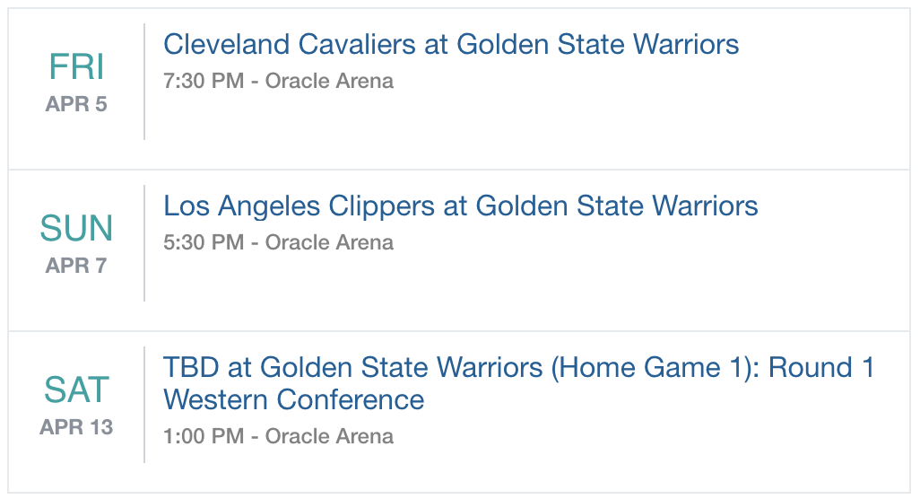
Event Listing
The Event Listing component shows a list of events for any artist in a given location.

<div class="stubhub-ui-component" data-token="YOUR_ACCESS_TOKEN" data-type="event-listing">Number of Events
The Number of Events component shows the number of events for any artist in a given location.

<div class="stubhub-ui-component" data-token="YOUR_ACCESS_TOKEN" data-type="event-count">About the Component Builder
- Type - The type of Visual Component. StubHub provides two types: Number of Events and Event Listing.
- Category - The StubHub category for the event you want to display (filters for events related to this category)
- Limit - The maximum number of events to render in the component.
- Performer - The performer to display the event data for.
- Location - The geographic location that the performer has events for.
- App Token - The StubHub application token. Required for making API calls to StubHub.
- Sort - How the returned list of events is sorted (by popularity, name, date, or distance and whether in ascending or descending order).
- Days - The number of days into the future to display events for a performer.
- Venue - The venue where the event occurs.
- Link Handling - How the linked page will display in the browser (as a new tab, as a new popup, or as a normal page).
- Event - The event you want the Component to display.
- Style - The style you want to apply towards your Component. You can apply either the StubHub-branded style or your own custom style.
Generating Code for Rendering the Visual Component
After you configure your component's parameter settings and click “Apply”, the Component Builder generates the UI for the widget, which automatically displays under the Preview area of the Builder dashboard:
If you are satisfied with the widget that's displayed, then you can click "Get Code", which pops up a dialog that contains the "copy-and-paste" code to embed into your application page:
Test the code in your application and you're off and running!
Controlling How the Link Displays
Depending on the desired behavior for an application, you may want to control how your browser displays a link to an event. Builder provides a Link Handling field that allows you to easily do this. Select any one of the following values:
- Normal - (Default) The linked page displays in the same window or tab as the current page. In the generated HTML, Builder does not add a data-link property to this code.
- Tab - The linked page displays in a new tab of the browser. In the generated HTML, Builder adds this code data-link="new" to specify that the link opens up a new tab.
- Popup - The linked page displays in a new popup window that is separate from the current browser window. In the generated HTML, Builder adds this code data-link="popup" to specify that the link opens up a new popup window.
Customizing a Visual Component
While you can use Visual Components straight "out-of-the-box" in your application, you can also customize a Component to match your brand or specify the event data that the Component returns.
For example, you can configure the CSS properties for a Visual Component by specifying the StubHub class name for that component and the CSS property (such as .stubhub-events {color:#000;}).
You can also specify the Event data that StubHub returns by configuring a Component's properties (such as data-location or data-filter).
For more details about customizing a Component, see Visual Components.
